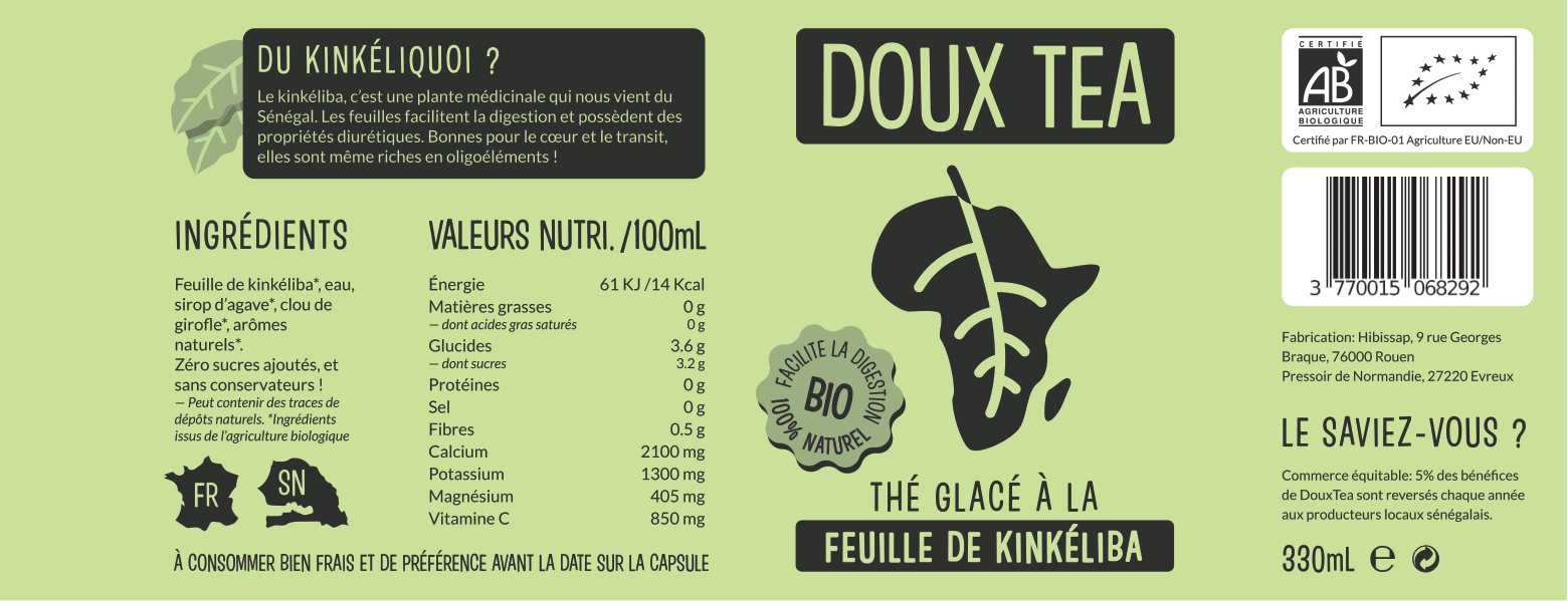
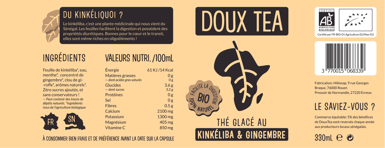
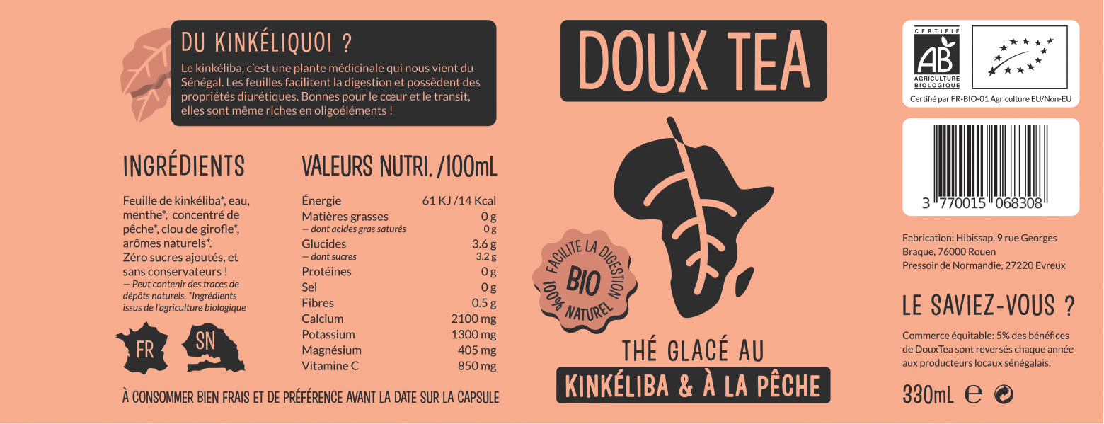
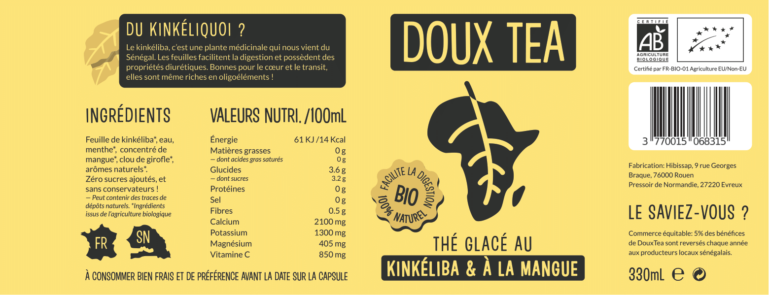
A refreshing iced tea with an ingredient almost unknown to the general public – an African plant, the kinkeliba. This requires a label that arouses the curiosity of consumers !

HAUS Division is once again partnering with the designer of HIBISSAP to create labels for its new range of healthy drinks, DOUX TEA.
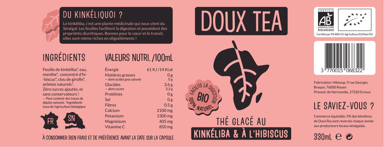
The key words of DOUX TEA are simple: its originality is the #1, and the benefits of the drink and its ingredients on the health of the consumer are the #2. The design of this range of iced teas from scratch, we gathered this information to create a logo and identity behind DOUX TEA. Green was supposed to be an indispensable colour for the basic label, a universal symbol of well-being and nature – while taste variations would differ by another main colour, ranging from savannah yellow to peach pink.

For the logo, many ideas were formulated by the client as to which keywords should be combined. We decided to focus on a simple concept: take a kinkeliba leaf, in its purest form and transform it into the shape of the African continent. Thus, for a European or American public, the drink is directly related to a certain exoticism and to natural health values by the plant and non-aggressive rounding.The biggest challenge when creating the packaging is often the layout of the text. A drink, in order to be marketed, must be accompanied by a good handful of legal information such as the list of ingredients, nutritional values, logos of Organic Agriculture or recycling… And on top of that, we need to add a few visuals and texts specific to the brand to strengthen the link between the consumer and the product !

Voici le résultat de ces cinq étiquettes !
Here is a 360° video experiment where Nathan Soares, co-founder of Haus Division teases what the company stands for. We let you see how cool it can be an immersive video recorded with accessible 360° cameras.
A new year, a new video, discover HAUS version 2.022 !
